Thinking clearer with visual dashboards
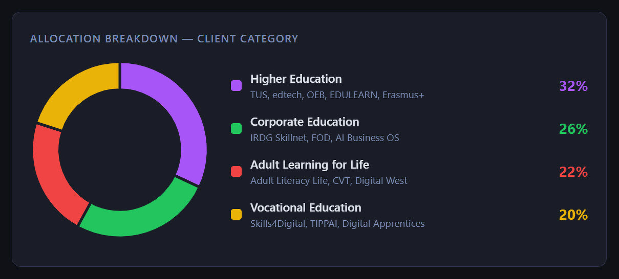
I am trying to visualise my work more precisely by auditing my routines several times a week. The main focal point is a colour-coded productivity doughnut (above). I want to present this framework of productivity to university researchers who are interested in amplifying their work with a knowledge management framework. It means Using Claude Cowork as a Research Assistant.
My Projects Dashboard is just a start. It springs from what Ethan Mollick calls “jagged frontier” AI use. At this juncture, observed during edtech26 in Ireland, my AI handles tasks (vault metadata parsing, HTML rendering, chart generation) that was always disproportionately time-consuming for me. I used to push this kind of task onto second year User Experience students and let them spin up samples during four hours of lab work. Now, because of Claude, I retain full ownership of my taxonomy, my priorities, and the meaning of my data.
Ten years ago, I shared Newport’s prescription to sports and fitness business students to show them how they should replace shallow-work overhead by deep work by making project-state information available at a glance, without context-switching. Now I’ve taken that precept and grounded it in my own highlighted principle from my Obsidian Vault.
Today, the hard part is not the output. Now the hard part is thinking about what the visually appealing dashboard tells me and how to continue evolving with tools which can lift me to higher levels of clearer thinking. Because Claude has relieved me of the busy work, I have a better focus for getting things done.